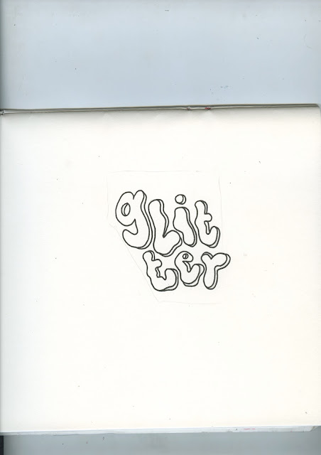
As i began to design the lettering for the front of the postcards i realised that due to how illustrative the lettering will be for each post card, i want it to have maximum impact. In order to ensure this i believe the lettering on the reverse should be less illustrative, rather just normal handwriting, this will allow the front of the postcard to have maximum impact and it will also ensure visual cohesion throughout each of the 11 post cards as the reverse will be the same, apart from some colouring differences.

No comments:
Post a Comment