During the course if this module, i completed briefs which challenged me as a designer in many ways.
The Penguin book cover brief (studio brief 1) was interesting due to the fact that people around me in the course were completing the same exact brief, yet interpenetrating it differently. This brief opened my eyes to my natural instincts as a designer, i chose to design the children's book as i felt that due to my skills and comfort with illustration and bright colours, the brief although i feel is visually relevant and successful, and received positive feedback from the group, didn't push me as a designer, with the outcome resulting in something i believe to be rather predictable in relation to my practice. This brief, and the underwhelming feeling i got inspired me to take on new design approaches throughout the rest of the module such as studio brief 4 in which i created a 3D head.
Studio brief 2 was the first brief I've completed where i didn't use any illustration or hand drawn elements (apart from some coloured detailing), the process of screen printing was challenging at times, and required me spending three days in order to complete a final print which i was happy with, although the actual setting up of a screen, exposing the image and printing it was something i'd never done before, the quality of the ink you get after you've screen printed can't be compared to that of a printer. Through learning how to screen print i believe next year i'll be able to advance the quality of my work further and use different printing methods within each brief, not just rely on a printer.
As previously mentioned, no illustrative elements were used within my final print, the print is made up of images i collected from a member of the ufo club my project was based on. Collecting these images and seeing the quality of them and the stories behind them showed me that sometimes less is more, and if you have images that are strong enough on their own, then no extra lines or illustrations are needed.
Studio brief 3 was the most challenging for my self, having never worked in a group for a design brief before i soon realised that work needed to be completed on time and their needs to be clear communication between all members of the group, or else it just won't work. There were members of my group who lacked the urgency to complete work, or even communicate when asked a question, in result the work created by the group wasn't as strong as it could of been. The group brief informed me that deadlines are crucial in order to keep the work balanced, and if you're working in a team then each member needs to be as motivated as the next.
Studio brief 4 allowed me to produce possibly the most rewarding set of designs I've done. I discovered through this brief that i enjoy making 3D objects and using them within the brief, i first tried out this approach during studio brief 2 where i drew lettering on to a jacket and used images of it within my final piece. I believe it's the time that goes in to making something which i enjoy, seeing something at the start and then once completed is a very rewarding feeling which really motivated me throughout the brief. I'm no longer going to approach a brief with the mindset that the outcome will be flat, or made up of flat surfaces and lines.
During second year i want to develop my skills with materials, using pottery and sewing within briefs, i also believe that working on a larger scale will be beneficial to me as it allows me to experiment with more media in order to come to a more developed final outcome, rather than an illustration on paper.
This module has been the most informative and has allowed me to develop both my skills and the way i will now approach a new brief, i feel as if I've grown as a designer and no longer rely on what i know i can do, rather i'm ready to approach new crafts, learn the skills, and utilise these within my design.
Friday, 19 May 2017
Thursday, 18 May 2017
Postcard Evaluation
This project was perhaps the most rewarding one i’ve ever done I believe this is down to the act of making a physical object, and having to wait 2 days for it to be complete before it could even be used.
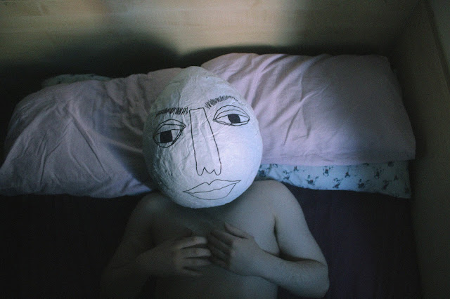
Within this brief i tackled design approaches which i have not yet used as a main visual element, whenever i’ve used photography before it had always been used as an accompanying feature however in this brief using it as the main visual element allowed me to produce outcomes which i couldn’t of previously produced.
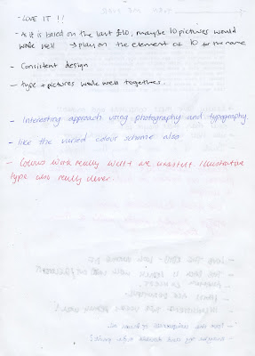
The feedback i received for this brief was the most positive i’ve come across throughout the course of this year, comments such as ‘amazing concept’ and ‘very personal and unique’ were made, it was also suggested that i make prints out of the images and sell these.
The reason why i found this brief so successful is because i approached it in a new way to myself and my practice, not relying on my illustration skills, and it resulted with a body of outcomes which are the most conceptually effective i’ve produced.
Continuing in to Level 5 i’m going to take away from this brief the fact that stepping out of your comfort zone can lead to more developed work. I’ve also discovered that i really engage with making a 3D object/ a physical thing which can then be used within a 2D piece of design.
Although the concept didn’t develop much from the initial idea, my skills as a designer have developed and in effect the way i approach a new brief will no longer rely on illustration and two dimensional explorations.
Assembled Postcards
Wednesday, 17 May 2017
Postcards front - and - back
After creating illustrations based off each of the 11 items, i have applied these to the post cards along with the potic-notes and adjusting the colours and slight variations on the layouts.
I believe the post-cards work well i communicating the life of a first year, the environment they live in and what they value spending money on. I wanted to ensure the post-cards were playful and fun and so this is why they're quite illustrative and handmade almost, a clean cut postcard with straight lines and digital type just wouldn't of worked for the humorous personality i was intending to communicate.
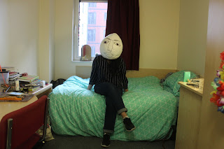
What i think is most successful about the series of 11 post-cards is the fact that all the images were shot in different rooms with different lighting, yet they all look visually cohesive despite their differences, i think the main reason for them being so successful is due to the head. It draws the viewers attention, sparks humour and is unexpected, something you don't normally get from a postcard. I also think the post-card idea was a good approach as the whole message of the project is able to be communicated without it seeming forced, something which i don't think i would of been able to achieve with creating a zine, as i originally intended.
The postcards will be printed on a thick newspaper print and will be double sided, newspaper print was chosen as it's very cheap; therefore relating the the message of the postcard, being that money is tight.
Back of postcard Lettering
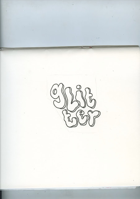
Using postic-notes and a felt tip black pen i created the lettering for the back of each postcard. The personality of the type came from gaining inspiration from the type on the front of the postcard, the item the person said they would buy, and the environment they live within. For example, the type on the post card which says 'a lamp' was created in quite a fluid way, this is similar with the hand writing on the postic-note (see hattie above), i wanted to relate to the lamp item by creating type which could be associated with a lava lamp.
Back of Postcard
After colour picking tones from the postcard image and using these on the back of the postcard, i began experimenting with the layout and type on the reverse.
I then experimented with the idea of writing the text on paper, scanning it in and having that on the back of the postcard, however the above designs felt too bare, even with the addition of the address lines and space for a stamp the design still didn't feel appropriate or as visually engaging as the front.
I added faint, and then more bold illustrations to the reverse of the post card, the illustrations relate to the lettering on the front of the postcard which details what the individual would spend their last ten pounds on. The white tone has been used to again link to the visuals on the front of the postcard, i feel as if this design links the whole item together.
As this new approach is quite hand made and personal, i think it's appropriate to adjust the colours, illustrations and lettering for each postcard design. The visual components which make up each of the 11 cards such and the layout and actual images, will link them visually however the slight changes will ensure each one has something new to offer the viewer.
The initial idea (see above) was to simply have the lettering consistent for all the backs of the postcards, in a white tone to ensure visual cohesion to the front of the postcard. However after doing this, the design felt underwhelming in a way, it felt like their needed to be more than just white text on a coloured background.
I then thought of the idea of making the back of the postcard a lot more collage based, this approach felt appropriate as these postcards are aimed at students, giving information about students; who aren't particularly clean or polished, it feels more natural and relates to the subject matter more to have a collage based design.
Using postit-notes i created the above layout, although the desing looks similar to the previous, the use of multiple textures and layers feels more appropriate.
I edited the colours slightly, in order to look visually cohesive to the front of the postcard. I believe this approach works a lot more effectively than the first, however i felt that something else could be added to really push the student aesthetic.
As this new approach is quite hand made and personal, i think it's appropriate to adjust the colours, illustrations and lettering for each postcard design. The visual components which make up each of the 11 cards such and the layout and actual images, will link them visually however the slight changes will ensure each one has something new to offer the viewer.
lettering colour
Tuesday, 16 May 2017
Lettering
As i began to design the lettering for the front of the postcards i realised that due to how illustrative the lettering will be for each post card, i want it to have maximum impact. In order to ensure this i believe the lettering on the reverse should be less illustrative, rather just normal handwriting, this will allow the front of the postcard to have maximum impact and it will also ensure visual cohesion throughout each of the 11 post cards as the reverse will be the same, apart from some colouring differences.
Post card
 |
| postcard dimensions: 4 x 6 inches |
Above is a sketch for the reverse of the post card. The back will be coloured, the colour will be taken from a colour within the room photograph. I did think of having the person who's room the image was shot in to write the 'dear mum, i've only got a tenner left, so i'm gonna spend it wisely on' in their hand writing, however i believe it will be more visually cohesive to have the lettering on the back in a similar style to the lettering i will hand draw for the front of the post card.
Monday, 15 May 2017
Crit Feedback + Idea development
After presenting my developed concept and showing some of the chosen, edited images i received very positive feedback.
Whilst discussing the format i which the images would be presented in, i mentioned the cheque book idea (image below), from this suggestion the idea of creating a series of post cards was developed (see image below). The postcards would be double sided (of course), one side featuring an image, and the reverse a humorous message in relation to the project of seeing what students would spend their last £10 on.
The post card idea i believe, will allow the whole concept to come across more, the actual format of the images will be a lot more practical and have a purpose which directly links to the overall concept.
Sunday, 14 May 2017
Edited Pictures
Above i have narrowed down the images for the project. I edited these images to add more colour to them, the reason being is because the images were all shot in the same type of bedroom and so although theirs personality and individuality within the way the student has decorated the rooms, adding more colour; deriving from the colours of their enviroment provides more room for colour experimentation and provides diversity throughout the images, as they all do center around the same type of bedroom and the same head.
Most successful images
From the previous contact sheets i have chosen images which i believe are the most successful in terms of showing the model in their enviroment, naturally. I'll take these images to a crit and get feedback on narrowing down which (if their are multiple shots of the same model and location) image to use per model.
In addition to taking the pictures, i asked each model what they would spend £10 on, answers in captions.
 |
| GLITTER |
 |
| PIZZA |
 |
| A LAMP |
 |
| BETTING |
 |
| PUB |
 |
| CIGARETTES |
 |
| CD |
 |
| IRN-BRU |
 |
| 30G GOLD LEAF TOBACCO |
 |
| POETRY BOOK |
 |
| RAMEN |
Subscribe to:
Comments (Atom)


