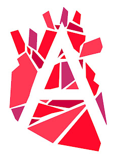
Below are the first design concepts i received feedback on. The feedback for design 1 mostly related to the legibility of 'appositional' with it being "hard to read", "difficult to understand" and "requires the viewer to look at it and concentrate in order to read it". This was obviously an issue as the logotype needs to be clear and easily visible.
 |
| (1) initial ideas |
Feedback for the second set of designs revealed the issue of appositional the dating app, being confused for appositional the organ donor charity; "looks like the logo for a medical brand, not a dating app", "looks eye catching but due to the type of heart you've illustrated, it looks more like an organ donor charity"
Design three received feedback of being "vibrant and modern" however based on previous feedback, it was clear that the anatomical heart illustration is not appropriate for a dating app (see below)
 |
| (2) working with the heart concept |
 |
| (3)colour variation |


No comments:
Post a Comment