However the balance of colours on the 'Lily' t-shirt meant that it could not be used, as you can see on the image below, the background tone is too dark resulting in the type not being legible.
However this doesn't really change anything about the project, the other 4 t-shirts are all up to the quality of all of The Prawn Shop t-shirts, the number of t-shirts that was going to be made was never released online and so there now being four t-shirts rather than 5 isn't the end of the world.
I understand where i went wrong with choosing the colour placement for this design, i don't think i factored in the fact that each colour would decrease in vibrancy and get darker due to the fact that the design in printed on a coloured t-shirt rather than a white one, and so the tones will adapt to the fabric colour. However, the 4 designs which did print well, look really bold and have a sense of impact on the t-shirts, and the mixture of (dark) purple tones, against the sky blue really work in harmony together.
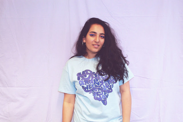
I sourced a lilac table cloth big enough for group shots, from a charity shop. The tone was thought to really compliment the purple tones on the t-shirt, and was also light enough that the focus would be on the designs, and the tone of the t-shirt could easily be seen.
I asked 4 girls to model for the shoot, i tried to use a diverse mix of women as diversity is one of the brands main messages. I gave direction throughout the shoot, whilst also taking the photos, to instruct the models to try and communicate a sense of strength, whilst also showing a community and friendship between themselves in order to reenforce the message that if you have been affected by sexual harassment/abuse, you're not alone, similar to the MeToo movement.
The shoot went really well and i feel like the models really communicated the sense of togetherness i was hoping to achieve. I tried to capture as many candid shots as i could in order to make the shoot look more natural and easy going.
Only having 4 t-shirts rather than 5 has actually turned out for the better, due to the fact that the website which The Prawn Shop store is hosted from, only allows 5 images per product and as i was planning to list all of these t-shirts together, as a collection, this means that i will now be able to use a group shot and also individual product images, so that it's easier for the customer to understand which design is which, rather than just using group shots and having to distinguish each t-shirt from each other.
Above are the best shots from the shoot. All of the images have been edited the same, slightly increasing the brightness and contrast, and adjusting the colour balance so theres more purple tones throughout the images, however i've insured not to edit the colour of the t-shirt/it's design, so that the customers are aware of what they're buying.
The next step is to add text to the images, detailing the quote on the t-shirt and the name of the t-shirt, i'm doing this as on some shots the text is slightly covered up in certain places, also to make it easy for customers to choose the right t-shirt.


No comments:
Post a Comment