Friday, 29 December 2017

Mayor of London branding pack (sb1)

Within the brief pack, it was mentioned that as the campaign is an open one, that the Mayor of London brand guidelines do not need to be stuck to if it doesn't make creative sense, however i thought it would be useful to look at some of the information provided in the branding pack to get a feel for what i should be considering to communicate.

AMBITIOUS We are bold and forward thinking in our communications. This reflects London’s status as a world leader in arts, culture, science, technology and finance.

AUTHENTIC We show a true London  that Londoners know and connect with.

ENGAGING We always encourage people to get involved. We want to inspire people to take action in our communications.

DIVERSE We reflect a city that is quirky, charming and adaptable –  we celebrate London’s differences.  

Thursday, 28 December 2017

Tube posters (sb1)

British artist David Shrigley and London mayor Sadiq Khan have launched a series of artist-designed posters for London's Tube for the #LondonIsOpen campaign, which declare that the city "will not cut itself off from the rest of the world" 
The following posters are a good reference point to see the type of London being depicted by the artists, and what new ideas could be experimented with.

Paul Catherall

Tania Bruguera

David Shrigley

Quentin Blake

Tuesday, 26 December 2017

Thanks 2016. It's been, weird (sb1)

Spotify's 2016 campaign demonstrates the use of data within creative campaigns.
Spotify searched through the data of their London users and wrote open letters to individuals within the campaigns, they ran 164 unique data stories in the exact neighborhoods where the listeners lived.

The way in which spotify have used real life data, in a humorous way communicates a sense of community within the music platform. It brings together the different people of London, with no indication of race, class, gender or sexuality, making the ad campaign about the real users, for the real users.


#LONDONISOPEN (sb1)

For my main brief during the responsive module i have decided to design for the JCDecaux brief in collaboration with the #londonisopen campaign.
The brief was found on the D&AD website, as part of their 2018 new blood awards.

The brief calls for an innovative campaign to be used throughout the 50 JCDecaux screens on bus shelters up and down Oxford Street.
The campaign should tell a story through the screens, one that shows that London is Open, it should stand out visually and inspire the audience through the simple yet powerful campaign.

The campaign should aim to show that London remains

  • entrepreneurial 
  • international 
  • creative 
  • a place of possibilities 
  • a place of welcome 
  • discrimination is not welcome 
  • diverse 
  • proud of it's history 
  • optimistic 
And as a city that brings together people of every gender, sexuality, age, creed, class, race and from every corner of the globe. 

However the brief specifies that not all of these points need to be touched upon as there are so many, but i should decide what story i want to tell through the screens and make sure that this is clear and relates to the campaign. 

JCDecaux  bring technology and creativity together, with billboards that can draw in / respond to social media posts, or adapt to things like weather, temperature, location, date and time, flight data, and more. It's suggested that i explore the possibilities of incorporation some of these aspects within the designs  in order to connect the people of London. 

Some restrictions of the brief are that all the screens must be static and can't resemble any traffic signs or signals and all designs must stay on the screen for at least 10 seconds. 

Sunday, 19 November 2017

sb1 and sb2 evaluations

Studio brief one was a very interesting design experience as it gave me an insight in to what it would be like working for a client. Although my client was quite slow in getting the content to me, and provided me with little research for the Garm Guide, i believe through my own research and through working closely with my client i was able to produce a publication which utilised it's content in a way that was appropriate for it's audience and for the context.
Both briefs during this module felt to be very context driven, which was a different approach for my self but one that i feel was useful to experiment with. When it came to studio brief two i felt more comfortable with the design process, i'm not sure whether it was because i was creating my own content and designing my own brief and knowing that i could follow it out until the end, or because   i really liked the idea behind the app and in a way was very excited to design something with a strong link to a well known film, this is something i haven't really experimented with before, in terms of my design practice, i tend to want to design things in my own style and tailor briefs the suit my style however within this brief i unknowingly stepped out of my comfort zone and designed a brief that i wouldn't of thought of doing. I think the reason i did this is due to the curve ball thrown at us half way through studio brief 1, our first brief after 3 months off, for me this allowed me not to get too comfortable which during the design process i thought to be a bad thing which was going to hinder my design, however now i see it as being a positive thing as it kept me on my toes and allowed me to experiment with new ideas. From this module i believe I've learnt that if i set my self with certain restrictions then i'll create more interesting or should i say less predictable work, because i know that if i was given the freedom to carry on with my original concept for studio brief one then i probably wouldn't of used any photography, or if i set the brief in studio brief 2 as one that was more familiar with and with an aesthetic similar to my own then i would have not learnt new skills such as creating pixel art.

Tuesday, 14 November 2017

animated app


Above is the animation i created using photoshop to demonstrate the sequence of the app use.
I created a gif using the layers in photoshop and set the time at 1 second per frame, i feel that this demonstrates each part of the app in a realistic time frame similar to the time the user will take on the app. The whole sequence of selecting your items and appropriate categories should be quick as the app is meant to be time saver for people who have a spare minute but aren't by their wardrobe.
I believe the app meets all the requirements i set out for Clueless to achieve, the backgrounds are fun and interesting which is an element closet+ lacked, the whole aesthetic of the app reflects the 90's video game era.
The refined choices the app makes available to the user also further the time saving point of the app, allowing it to make appropriate choices for the user based on their intended location and company.

Below is the app icon which will be on phone home screens, i took the camera pixel icon which is visible throughout most of the app, the background used is a section of the background which runs throughout the app.

After completing the app design i presented it to some peers to receive their feedback.
People commented that the app is "designed perfectly for it's purpose", they appreciated the context behind the design decisions also; "the app is very well designed and the inspiration behind it makes the design even more impressive and appropriate"

I am overall very confident with the app design, the context really pushed the design decisions and in result created an app which provides a fun and contemporary take on choosing an outfit.

completed app design

Below are the completed screen designs based off of the wireframes i created.
The colours are vibrant to reflect the colours used within the clueless film, the use of the pixels i feel are appropriate in relation to the 90's aesthetic.


I   will use photoshop in order to animate the app to give an idea of the transitions within the app, although i've never animated anything before, this will be a good learning experience and hopefully enable me to use animation within my later work.

Thursday, 9 November 2017

pixels in use


pixel icons


Opposite are the completed icons inspired by Susan Kare.
The icons will be accompanied by a key at the beginning of the app under the instructions section in order to inform the user what the icons represent; if it isn't initially understood.

The colours o the icons has not yet been decided, although i think black is appropriate as it will stand in contrast to the illustration clueless inspired backgrounds, using contrasting tones to the colours on screen may also work.

Wednesday, 8 November 2017

Wireframing

I created wireframes to enable myself to see how each stage of the app will work, the wireframes act as a visual guide that represent the skeletal framework of the app.


Whilst designing the wireframes i also applied each of the icons that will be used throughout the app, these icons which i am creating; taking inspiration from Susan Kare, will be used instead of type.

Friday, 3 November 2017

susan kare


I researched in to the design of Susan Kare, the designer of many typefaces, original marketing material and the icons used for the original Macintosh. Her work inspired many existing computer graphics tools and accessories such as the Lasso and Paint Bucket tool. 
Her pixel art has inspired me to create my own series of pixel icons to communicate certain options within the app. Instead of using text for the options such as daytime or nighttime, i will instead create pixel symbols to represent these. This will ensure a more direct link to the 90's through referencing 90's style video games make it more fun for the users and have the appearance of an old style operating system, like the one the main character in Clueless uses to choose her outfits. 

I intend to keep the use of actual type to a minimum, to make the app more visually fun for the user and to set it apart from existing apps similar to this one already on the market. 

Whilst thinking of ways to make the app more desirable for its user i came up with the idea of having a restriction on how many items of clothing you can upload to the app. 
The app will allow the user to upload the following amount of images: 

  • 10 x tops 
  • 10 x trousers/jeans 
  • 10 x skirts/dresses 
  • 10 x coats/jackets 
  • 10 x shoes 
  • 10 x accessories 
By setting these restrictions, the user will find the process of uploading pictures less tedious, as theres a restriction, it will also make them really think about what they actually wear and perhaps allow them make more conscious decisions when it comes to buying new clothes. 
Of course the user will be able to upload other items of clothing, if they want to see new combinations or if they've bought a new pair of shoes, however they will have to remove an item before adding a new one, if they're already on 10. 


patterns


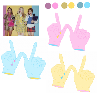
Using the line drawings scans, i then picked tones from a promotional image for Clueless and added tones to the line drawings.
After adding the initial tones, i made some slight colour changes to create different variations that were still vibrant and bold and had a 90's feel. Although the colours and the imagery work along side each other, i feel as though the hand illustrations are a lot more visually appropriate and the lines are clean and thin and work in making a really visually interesting pattern design. 

I think i will use the hand pattern illustration only, and instead of having a different illustration pattern per page of options, i will use a different colour variations instead. 
Here are the different colour variation patterns i will use throughout the backgrounds for the app. 

Thursday, 2 November 2017

pattern scans


 I've taken inspiration from the stills from clueless to create illustrations which i will then turn in to patterns to be used as different backgrounds throughout the app. 

imagery references

I collected stills and promotional images from the film to get a feel for the 90's aesthetic, whilst looking at the reviews for closet+ it was noted by a user that the app could be improved if they had amore interesting backgrounds. I developed the idea of creating different backgrounds, based on imagery from the film, the background will change each time the user refines their outfit choices more. Below i will pick out certain patters, colours or iconography which i could then illustrate from and create bold, fun, 90's styled patterns from.

  • diamond tartan 
  • bold colours 
  • wig
  • hands 


  • leopard print 
  • 90's mobile phone
  • red lipstick 


  • black and yellow tartan 


  • roses 
  • pattern on hat

  • tie dye 
  • cher keychain 
  • pen with feathers

Wednesday, 1 November 2017

Type

For the body copy type i felt that a type style with spaced letters and an element of non conformity would work well with the theme of the app and the film it's based upon.

I couldn't find the exact type that was used on the films promotional material/film box, however i did find (what i believe to be) the exact type used on the computer screen in the opening scene, this type is used on the device which chooses outfit options for the main character and so i feel that using this type within the app is very appropriate as it links to the main inspiration behind the app.

 The type is called 'krungthep', in addition to the link with the film, the actual style of the type is very appropriate for the characteristics i hope to achieve through the design of the app. I intend for it to be fun, individual, fashionable, bold and have a link to 90's aesthetics.
The almost futuristic, computer like style of the type i feel will work well in achieving the characteristics i have set out.

Tuesday, 31 October 2017

Human Interface Guidelines

I've been researching on the developer.apple.com website into guidelines i should follow when creating the app and I've found some useful information on the website.

If possible, support both portrait and landscape orientations. People prefer to use apps in different orientations, so it’s best when you can fulfill that expectation.


Above are the size specifications for different apple products. I had it in mind to design the app predominantly for phones rather than ipads, as the user is more likely to have their phone on them whilst out of the house, than an ipad. And so for design purposes i will design the app to an iphone sized format.

According to market research firm Strategy Analytics the iphone 7 and iphone 7 plus are the world's most popular smartphones. For this reason it seems appropriate that i create the design following either the iphone 7/7 plus size guide lines.

closet +

Before designing the app i carried out some research on existing apps and websites similar to the one i'll be creating.
 Closet + is an app which allows people to upload their wardrobe and create outfits themselves.

I found reviews for the app useful as a way to show me what aspects i should not include within my app, and how mine can be made more efficient for the user.

"Closet+ Worked fairly well but it was pretty basic.  You could take photos of your clothes and add them but you couldn’t edit out any backgrounds.  Compiling an outfit consists of adding putting the pictures of the outfits next to each other. It wasn’t very “pretty"  
The problem with Closet+ seems to be that the user has to do all the work them selves, it's more of an organizer than an outfitter planner. The reviewer also commented that the app wasn't very 'pretty', from the images of the app below it shows a very bland, simple 

design, add in different backgrounds is something i feel i need to consider, along with using colour rather than black and white, neutral and minimal tones. Clueless needs to be a fashionable, creative, stylishly designed app which brings back the fun of planning an outfit, rather than solely making the app function-able and time saving, it needs to be fun, unique and makes the user trust and want to wear the outfits created by the app. 

Monday, 30 October 2017

brief

Clueless;  for when you have a spare minute, but you're not by your wardrobe. 

I will be designing an app under the name 'clueless' the name comes form the initial inspiration behind this whole project, the 90's film Clueless. In addition to this, the word also suits the actual purpose of the app, to help women who are 'clueless' about what to wear, decide. 

The app is targeted a 18-25 year old women, 

User profiles:

Female, 25, works in an office, likes to socialise with friends, work orientated and professional, wants a more exciting job so dresses stylish to work. 

Female, 20, university student, very big wardrobe, goes out with friends and on dates, at uni till late & struggles to find the time to plan what outfits to wear.

The design of the app should provoke a sense of order and clarity. As well as this, i wanted to experiment with using 90's aesthetics within the design, in reference to the film i could also take patterns from stills within the films, or colour combinations. 

Although the app needs to eliminate the stress of looking through loads and loads of clothes, i still want the design to be playful and fun, as the app is all about different combinations, and each persons individually style being tailored in the right way to make a complete outfit. 

The type used for the body copy within the app should be easy to read, yet modern and appropriate to the context, however i think including some hand drawn type within the app will link to the aesthetics of the film and link to the fun nature of the app- as it's almost like a 'grown up' kind of dressing up game, and by connecting to this feeling i believe the users will like and appreciate this. 


layout ideas


When thinking about the most effortless way for the app user to receive accurate and appropriate outfit choices i made made a diagram above of what i believe is an effective way to allow the user to quickly make decisions to inform the app in order to make the most appropriate outfit choices.

Each time the user clicks on an option it will then transfer to another option screen, the user will be able to choose more than one option, if say they want the outfit to suit work and a party.
After completing the option choices, the user will be presented with 5 relevant outfit options.

Friday, 27 October 2017

screen based design analysis

I analysed the Lazy Oaf website and its screen based design in detail in order to see what elements work, and what make the design more difficult for the user.

when the user first goes on to the website the logo can be seen at the top of the screen, and it's position remains there throughout the navigation of the website, as i later noticed whilst going through the website; the little con accompanying the logo text is animated, and the eyes change position every 10 seconds or so.


The layout of the website home screen is very clean with a focus on the outfits- the white background assists the minimal design along with the black text with the accent of colours matching the tones within detailing on the outfits.
when the user clicks on the shop icon, different options drop down within a faded box so you still see the home screen whilst choosing options. 


when you the click on an option eg 'womans' more options appear, theres then a light grey highlight when you hover over a more refined option. 


You're then taken to the actual images of the clothing, two images are shown per page view, the images are very vibrant and engage the customer to look at them in detail due to the up close image view and the limited amount of images per page view (2 every time you scroll down).


when you then click to add something to your basket- the layout is more compact, the image reduces in length but expands in width and all the options and information such as sizing, size guide and item specifications are clearly visible along side the item of clothing. 

each icon changes in colour when you click it, going from white to black.
You can then see the item, its price and checkout options at the right side of the screen. 

Another thing i noticed during the course of going through the website is that on some items the image of the item changes through each stage of the buying process. 
  • FIRST VIEW - in regular shopping mode where all the options are there for viewing. 
  • SECOND VIEW - when you choose to look at an item in more detail. 
  • THIRD VIEW - when you've added it to the basket before checkout. 
I haven't really found many faults within the website, although if i was to suggest any changes, there could be an easier way to add an item to your basket, say if you didn't want to look at it in more detail then you could just automatically add it to your basket, or perhaps a quick view like on other clothing sights where you hover over the item and you can see the details of it zoomed in. 


Thursday, 26 October 2017

slight change of direction

After discussing my idea with one of the tutors we slightly developed my idea. 
The online fashion shopping store ASOS has introduced a new feature where there's the option for an online personal shopper; you can tell them what sort of look you're looking for, your price range and size and they will suggest a complete outfit for you. 

This lead me on to the idea that the app could create complete outfits for you based on the items you photograph and put on to the app, your style, where you're going to wear it to (by syncing up with your calendar). The app will therefor save you time but also suggest outfit ideas that you might not have considered, using items that you may have forgotten you even own.

The app would most likely be used late at night whilst the user is laid in bed thinking of what to wear tomorrow, or if they're rushing home from work, running late and want to know what to wear so they're not stressing about it once they arrive.

User profiles:

Female, 25, works in an office, likes to socialise with friends, work orientated and professional, wants a more exciting job so dresses stylish to work.

Female, 20, university student, very big wardrobe, goes out with friends and on dates, at uni till late & struggles to find the time to plan what outfits to wear.

Female, 30, doesn't have a lot of clothes, struggles to find time to go out and see her friends as she's always working, needs the app to make new outfits out of the limited choices she has.

Tuesday, 24 October 2017

group discussion

This morning whilst discussing my idea with some peers we developed some more features for my app in order for it to solve more problems. The ideas which were discussed were to include:

  • A wash icon - where you can see what clothing is in the wash, and there for not available. 
  • Link to the weather forecast - this will allow users to choose weather appropriate clothing, also the app could suggest items based on the weather. 
  • Link to depop - depop is an online selling platform where people auction off their old clothes, similar to eBay, but purely fashion based and predominantly used by 16-30 year olds (which is the audience i think i'll target the app at), by including this feature it allows the user to reduce the clutter in their wardrobe by seeing what they don't really wear and giving them the opportunity to make money and reduce clutter. 
  • Favourites section- this feature will allow the user to see their go to outfits which they know work, to save extra time if in a rush 

only studio

Today the class had a talk from only studios co-founder Matt, only studio focus on screen based design and through his presentation he gave us useful insights in to studios design process.
One point which he told us about which i found very interesting is the process they go through of making 5 personas of people who would use the screen based design.
He noted that by creating personas of the intended target audience detailing a characters name, age, job and interests provides you with the opportunity to see if your design is suitable for your customers.

STUDIO BRIEF 2: design for screen - have you seen clueless?

The brief is to create an immersive and engaging screen based user experience for a media of our choice such as website, app, streaming or a service etc etc...

I need to identify the client, problem, target audience an overarching aim of the project. The brief requires us to maximise the potential of digital devices, available to be global and use mixed media.

Other things i need to consider are the process and procedures involved in designing for screen, the relationship between designer and developer, the role and skill set of The developer and research in to what already exists and how my design can be innovative.

Whilst thinking of ideas for my screen based design i began to note down ideas of problems i face

  • not drinking enough water - already an app for that 
  • killing plants (by not watering them) 
  • not knowing what to wear 
  • clothes not looking right once they arrive from online 
  • shuffle not playing the right mix of random songs
The problem i feel as if has the most potential is the not knowing what to wear/clothes not looking right. These ideas, and a solution came to mind after watching the 1995 teen film Clueless. 

Within the opening scene of the film, the main character Cher is deciding what to wear using a t.v screen based application where she can see all the clothes she has in her wardrobe and choose an outfit to wear, rather than finding different things and actually trying them on.

This saves time and makes the whole process a lot simpler. 


My idea is to create an app which allows the user to photograph all of their items of clothing and store them on the app, they can then put together items to make an outfit and save the time of looking later. The app will also allow the user to see what potential items that they are considering buying would look like with items they already have. This idea also crosses over with the 'clothes not looking right once they arrive from online' idea as it also tackles the issue of having to send clothes back if they don't look right once they arrive. 


Monday, 23 October 2017

GARM GUIDE PRODUCTION


 I used a sewing machine to bind the Garm Guide, using translucent thread. The guide was going to be sewn by hand however using a sewing machine felt more appropriate as it references the ways in which the clothes featured inside the Garm Guide were made.


GROUP CRIT

After presenting the Garm Guide (although not yet fully finished, or printed on the correct paper or bound) to the group, i received feedback.

Many people commented that the style of the guide was appropriate and visually engaging and interesting, although i received feedback from several people commenting on the cluttered stle of the guide.

As stated in the rational i wrote to accompany the guide, the style is meant to be cluttered to mimic that of a vintage/charity shop where you are looking through many many items of clothing, of all different styles and colours in order to find the one item that you actually want.
After showing my client the guide and explaining the choices behind the design, he agreed that they were appropriate.

I feel as if the people who left the comments regarding the cluttered design failed to fully read the rational, in order to fully understand the design choices.

Wednesday, 18 October 2017

PAGE DESIGN


I began to design the inside of the publication. Above you can see examples of some of the pages so far, and shown right is a pattern illustration i've been using throughout them all.
The design i was hoping to communicate through the publication pages is the funky element of vintage clothing with a creative and illustrative twist.
The layout of the pages in quite cluttered, with the addition of wavy text in order to provide information but also to reduce space on the page. I wanted quite a closely spaced layout to make a reference to the cluttered nature of the vintage/charity shops most of the outfits are from, with the idea that people are always having to fight through the clutter to find what they want.
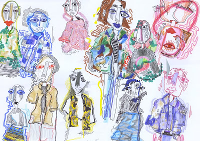
The illustration (left) is used throughout the background elements of the pages, i created a design taking reference from the lines in the fashion illustration, and edit the colours and saturation slightly depending on the colour scheme of the image.
I showed my client the first few pages and he was very very happy with them, commenting that i've managed to turn the content in to a really visualy interesting and relevant design.

Monday, 16 October 2017

NEW COVER

After designing the title page of the publication, the previously designed front covers didn't look like they belonged with the style the pages are going to go in.


Taking a new approach with the front cover design, yet still wanting to keep some of the shapes from the initial design as i do think that these represent the clothing appropriately, i collage some of the images that will be within the book together.


I then used the previous pattern design to take away sections from the images, to not only hide some of the outfits but to also allow room for further imagery, in order to give the reader a taste of whats inside but not giving too much away. 


I then collage together some of the outfit illustrations. 


The cut out 35mm photographs were then laid over the illustrations. 
I believe this design works well in communicating to the reader the theme of the book, whilst still including the pattern from before but in a much more visually appropriate way.