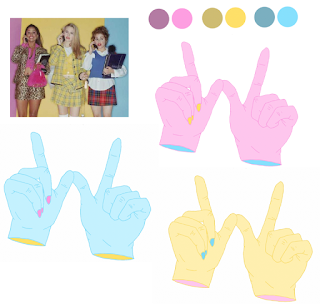
Using the line drawings scans, i then picked tones from a promotional image for Clueless and added tones to the line drawings.
After adding the initial tones, i made some slight colour changes to create different variations that were still vibrant and bold and had a 90's feel. Although the colours and the imagery work along side each other, i feel as though the hand illustrations are a lot more visually appropriate and the lines are clean and thin and work in making a really visually interesting pattern design.
I think i will use the hand pattern illustration only, and instead of having a different illustration pattern per page of options, i will use a different colour variations instead.
Here are the different colour variation patterns i will use throughout the backgrounds for the app.


No comments:
Post a Comment