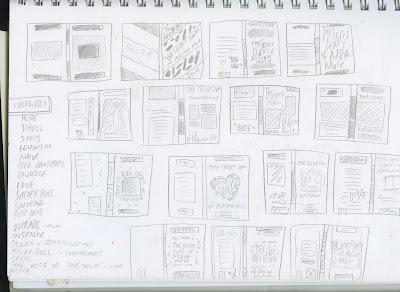
After researching Adrian Mole i began to generate thumbnail sketches of possible design layouts.
The second image shows more in depth thumbnails of ideas, at the time, i thought were going to be the most successful.
I began designing the 3rd thumbnail sketch on the second image, taking influence from the existing Penguin Chalk series (see below)
with the concept of a design featuring hand drawn lettering (based off of cambria regular) with illustrations entrapping the type, however this concept was not successful (see below).
As stated on the requirements for the brief;
"We are looking for a striking cover design that is well executed, has an imaginative concept and clearly places the book for its market. The cover should encourage children to pick up the book and buy it for themselves and should also engage adults to want to buy it for them.
While all elements of the cover (front, back and spine) need to work together, remember that the front cover has to be able to work on its own, and to be eye-catching within a crowded bookshop setting as well as on screen at a reduced size for digital retailers."
When i compare the design to the requirements it meets few if any, the colours are too 'nice' they're classical, where as the over needs to attract a new generation of readers. In hopes of perhaps creating a cover from this design i tried out colour schemes such as the one below, but the design just feels too predictable, quite obviously now i shouldn't of take inspiration from existing book covers so heavily as it removes any originality from the design.
There is a part in the book where Adrian goes camping but forgets to bring the toilet paper, similarly to the previous design i wanted to incorporate elements from the book; notable iconography, and place these on the cover to give the potential viewer an understanding of the themes, but i felt like his should be more subtle.
I began experimenting with using toilet paper as the background for the cover, a subtle link to the text.
Before coming to the idea of using toilet paper as the background, i tried out illustrating on to the actual paper, however quite clearly the bleed from the ink just didn't work.
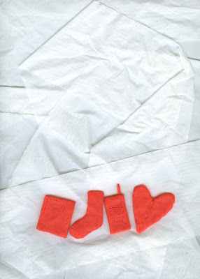
I began thinking of ways i could include a form of imagery yet still use the toilet paper within the design and then i had the concept of creating models of items from the text and placing these on the toilet paper instead.
I began by taking play-doh and forming items such as a diary, a red sock, a love heart and a telephone (all relating to parts of the text)
 |
| (note: using felt-tips on play-doh is not a good idea, your pens will stop working) |
I then began scanning in different compositions using the toilet paper and models to see if i could find one tat would be appropriate for the cover of a book.
I believe the third composition is the most appropriate as it leaves enough space for the rest of the text required on the front.
Previously i stated i would use Cambria regular, however i started experimenting with hand drawn serif typography.
 |
| Deliberately not filling in the type correctly to give the childlike effect. |
Due to not having an illustrative element to the cover i feel like it's appropriate to use hand drawn type as it gives the book character and is appropriate for the audience rather than using computerised sans serif text.
Here is the second concept designed. I used a typeface recognisable to the penguin brand (Gill sans)for the review, and will most likely use this type again on the reverse of the book cover, to break up the amount of hand drawn type within the piece.


