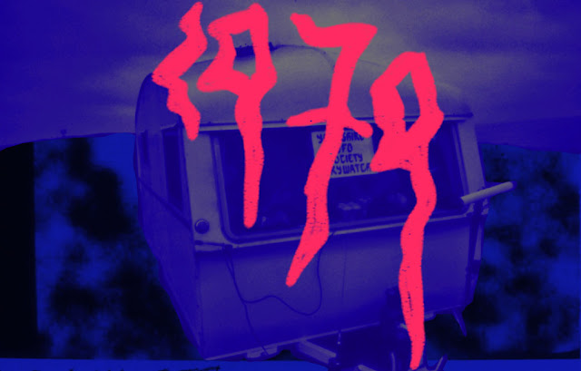
Here I have begun using the images provided by Philip to create designs which capture the celebratory theme of the poster.
I took these designs to a crit whilst also explaining my ideas for either development; abandoning the jacket idea and using Philip's images instead.
In the crit however, people really liked the jacket (see previous post) and stated that t wouldn't be 'cliche' or making a mockery of the society, it just allows people to usnderstand the theme more and also celebrates in both past and present by using Philips images from the 80's and photos of the jacket on a model today.
I'm going to photograph the jacket on a model in the location of Notth Street which is where the society meetings took place; to further the contextual links between the piece and the past organisation.
Having looked at the work of Richard Hamilton I feel that the combination of collaging the past images, present images and colour together will work really well in ensuring the elements work together as a cohesive piece.
Below is continued development using the imagery provided by Philip, very early stages of design working with the two tone restriction of the piece and also turning the images in to bitmap images reading to be screen printed.
Pink and blue have been used as they're very bold colour and I want the piece to be eye catching due to the quirky nature of the society, however as I begin to work with the images I will soon take, a deeper understanding of what colours to use and why will hopefully be developed.


No comments:
Post a Comment