Sunday, 27 November 2016

Study Task 01

Study task one was to test how people reacted to the interventions we set out in public, focusing on creating diversions, creating a connection and making someone pause or stop. 

Within the video created a diversion out of string weaved around concrete pillars. We wanted to test whether people would go under the string, around the string or disrupt it in order to pass through. Quite a lot of people avoided it and took a new route, however some interacted with it and some ripped it off the concrete completely.
We tested this in front of a city college, where the students are from the age of 16, i think choosing a different location where there were different ages of people would of been more effective in seeing how different age groups interact with a diversion. 

Another intervention was attempting to create a connection using a balloon and tying it to a metal gate near a crossing. This location was chosen as people are stopping and waiting there and so they have time to interact with the balloon if they desire to do so. Only one person interacted with the balloon, and popped it. 


Frutiger

within Adrian Frutiger's 'Signs & Symbols: their design and meaning' he addresses the characteristics of signs and how the shapes shape the meaning of them. 
The Square is describes as possessing a "boundaried property", also provoking imagery of floors, ceilings, walls and protection. 
The positioning of the square alters the received message of the sign, when the square becomes an oblong, Frutiger describes it as loosing it's symbolic character, the symbolic character in a prehistoric sense that it represents the earth surface. The difference between length and breadth, Frutiger says makes the viewer "look for the intention of the difference"
When the square is standing on it's corner, the field of oblique lines creates a disquieting sense, with the position of the point being said to indicate certain intentions; which suggests why this is used for traffic signs.

If i was to repeat my interventions and actually create some form of sign system and not just use objects, one idea would be to create the same visual on 3 different squared signs, one a square, one an oblong, and one as a diamond and see whether the dimensions or the positioning effects how the public react to the visual. If it was for instance a stop sign, would people stop for an oblong shape, or are they more likely, as Frutiger suggests, to stop for the disquieting sense created by the field of oblique lines.   

The triangle; Gestalt psychology indicates that human attention is primarily attracted by vertical and horizontal movements. Placing a triangle vertically on it's apex provokes a direction an therefor gives it character whereas triangles with horizontal sides are ideal for use as signs which are communicating signals such as road signs which Frutiger says is due to their symmetry. Further to this, the triangle which has a horizontal base is seen to communicate the impression of stability, coming from it's similarity to a mountain which is constantly static. The triangle standing on its apex however, is described as being a much more active character as it's the symbol of a tool, an action and also of scales. 
When comparing the two triangles, Frutiger comments that the first sign is seen as a friendly symbol where as the second tends to produce a reaction of alarm.

Creating interventions using the triangle shape and Frutigers comments on their personalities has made me consider the idea of switching the expected content of the shapes around, for example, if the design was coming from a subjective design point, the triangle with the horizontal base could contain a non 'friendly' message, where as the triangle standing on it's apex could contain an almost calming design, one which counteracts the reaction/alarm it it expected to create. 

The circle, Frutiger describes the circle as having strong symbolic importance to primitive humans due to its association with the sun, moon and stars, today however it can be linked to wheels and gears, in short, the circle is associated with the constant movement of our world today.  

Frutiger comments that depending on the viewers character, they will place themselves either inside or outside of the circle. The inside of the circle can feel quite closed in, protected from the outside, disquieting and even claustrophobic. Whereas the outside of the circle and the idea of breaking free from the boundaries of the metaphorical circle can raise feelings of pressure and anxiety. 
The circle, as previously mentioned, is also linked to the constant movement of society today; Frutiger notes that the circular movement of the wheel and the travelling and rolling associations with it can give the viewer a feeling of insecurity due to the eternal recurrence of the travelling circle as it doesn't have a beginning or end. 


Thursday, 24 November 2016

Design Process Briefing


Related image
Mijksenaar

Studio Brief 1: wayfinding 

Wayfinding serves the function of informing people of their surroundings. Within this brief we are to focus with a subjective nature in which we design a personal sign system of our own interpretation of the spaces around us, with the expectation of poetic sings, imaginary sign systems and conflicting signs etc being created. 

Sign systems can me objective or subjective. Objective in the sense that the signage is functional, independent of the person and universal or rather subjective, in which the sign designed around an opinion or feeling relies on an individuals interpretation.
The focus of this brief should be a subjective one. 

OBJECTIVE vs SUBJECTIVE 
uniform, stable, clarity, universal, scientific, authority 
vs 
varied, dynamic, stylized, decorative, peculiar, novice 

Experimental Jetset
Image result for mijksenaar
Most sign systems have the appearance of an objective, functional, almost scientific construction. However, under the surface one can find many subjective motives. Take for example the work of Paul Mijksenaar, designer of many iconic sign systems. In a text on his website, Mijksenaar writes about multilingual signs. After explaining why English should be the dominant language in all international airports, he continues by writing that airports in English-speaking countries should only use English and never a second language, because such usage of a second language would “patronize the traveller who doesn’t speak English, and who will never learn English if things are made too easy for him/her”. Here Mijksenaar shows his subjectivity: his view on multilingual signs is based on a personal viewpoint (the ideas that everybody should learn English), and not on the functionality of the sign system (the idea that everything should be “as easy as possible”).
We fully agree with Mijksenaar: we also think that the role of the designer is not to make things “as easy as possible”. There are many other responsibilities that should be taken into consideration: aesthetic responsibilities, conceptual responsibilities, etc. In other words: responsibilities of a subjective nature that go far beyond the narrow definition of functionality.”

Above is a quote from Experimental Jetset on the work of Mijksenaar, although his sign systems may have the appearance of being universal, functional and objective there is a subjective nature driving his design, communicating his belief that the designers job is not to make things "as easy as possible" for the viewer, and so he only uses the English language within his work. 

Otl Aicher

Otl Aicher's designs for the 1972 Munich Olympic Games communicate objectivity. Aicher's articulation to the multi-lingual and multi-cultural audiences through his pictogram system highlights the simplistic, objective approach that can be taken to information design.


Otl has used pictorial symbols to ensure the appropriate communication is received by all viewers, unlike Mijksenaar, his objective designs are easily received and do not make the viewer think for too long, with no underlying subjective design. 

Saturday, 19 November 2016

Jo Blaker

During a talk from Jo Blaker, she talked about her focus of collecting and gathering, looking and noticing; being drawn to natural forms and the qualities of line from nature. 
 

Being able to look through her sketchbooks has inspired me to let go of the idea that my sketchbook work should be laid out with precision, and rather, create and experiment and collage and use colour to express many ideas without doubting whether or not they belong. 

In my work i like to use many lines within portraits like Jo does, however i'd never considered collaging materials and combining them with the line work before now. 

Another quality of Jo's sketchbook work which i think works effectively is the variety of materials she uses to get different line qualities and textural effects, but also the versatility of one singular material such an the oil pastel piece above; and the way she is able to create many different effects which can all be used to communicate different messages once applied to a piece of work.

Monday, 14 November 2016

Module Evaluation


During this module I've not only gained a further understanding of typography as a whole, but also a further understanding in to the varying personalities of fonts and how their uses all differ. This has definitely informed me to make more informed decisions in my design future when selecting a typeface to use, ensuring that the personality of the type reflects the type of message my piece of design is trying to communicate. 

My development and new found understanding of typographical terms will make it easier in the future when i'm manipulating/ explaining how i would alter type as i'll be able to use the correct terminology to explain my design intentions. 
One of the first tasks set was to find and produce letter forms out of our surroundings, this informed the idea for my typeface design, as i saw a letter form within some tangled wires. During this Module i created/manipulated type using Adobe Illustrator, at first i was hesitant as I've never used this software before, but through processes of trail and error I've created work on illustrator which I believe meet the individual aims of each brief, and have developed skills along the way which i will develop throughout future modules and apply to future design work. 

Further to this, I've realized the importance of sketching out ideas as they come in to my head, instead of worrying about the layout/ how the sketch looks on the page. Form doing this, the breath of my ideas has expanded ensuring that I've explored many possible designs concepts before moving forward with one.  
Looking back on this module i think i would of benefited from doing more in depth research, especially for brief 01, by doing so i think my design outcome would of been more informed. As far as time management goes, i feel like i kept on top of the brief well, however i need to have a more direct focus and choose what concept i want to develop further, sooner therefor leaving more time for in depth research and design experimentation. 
As i previously mentioned, i realized the benefits of sketching out a range of ideas before moving on to digital development, unfortunately i didn't sketch much during the first brief, i think my outcome could of been taken further had i explored a range of hand drawn variations before hand.    

Having group crits during the development of my work really helped to gain other ideas and feedback on my work. A lot of my design decisions were informed by the opinions of the people around me. Interim crits were the most useful as i was able to present my work and ask questions about any queries i had with my work, for example whether the confusing personality was being communicated strong enough through my type design. 

Studio Brief 02 - Type Specimen & Evaluation


Throughout the production of the confusing typeface I constantly wanted to esure that the  confusing, jumbled and tangled personality was being communicated. Following a final crit of the typeface I received feedback which confirmed I had communicated the personality; “The typeface reflects the adjective well with the difficulty of legibility adding to the overall effect, lower-case would of perhaps been even more confusing as capitals tend to be easier to understand”. When deciding whether to create a capitalised or lower-case type-style, the context that the type would be used within informed my decision to create an capitalised one as posters tend to use minimal text, made up of a few words rather than sentences where lower-case type would tend to be used. 
I was concerned that the legibility of the type may be effected due to the amount of strokes however further feedback I received noted that “confusion is being conveyed whilst the letters are still legible”. 
Due to the expressive nature of the type, this brief has made me realise how crucial it is to choose the correct typeface to communicate a certain message. This typeface can’t be used on a mass large scale as it’s so expressive of it’s personality unlike the neutral Helvetica it was created from.
If I was to make any adjustments to the confusing typeface, I would experiment with trying to create a joined up lower-case variation of the typeface; playing off the idea of having one singular wire which would twist and bend to create all 26 individual letter-forms.

Wednesday, 9 November 2016

Studio Brief 02 - Colour Experimentation

1pt confusing type variation with added colour shadow, in order to see whether the type would work when applied to posters of colour rather than just acting as a black toned typeface alone. I believe the colours and use of shadow work well in adding vibrancy to the design; furthering the contemporary personality of the type whilst still communicating, and i believe furthering the tangled look of the design. 


Studio Brief 02 - Experimenting With Colour


As i have created the typeface, i believe it's crucial to see how the typeface will look as the main visual element of a poster; as that is what it's primarily designed for. 


I've added some basic colour to the typeface cluster design, i think just using two tones is appropriate when using the 0.25pt type variation as too much colour will confuse the viewer too much; experiment with using multiple colours on either 0.75pt or 1pt

Studio Brief 02 - Variations

Here are the variations which the confusing type face will be available in.


I believe the typeface design communicates the confusing, tangle, jumbled personality of the type i was hoping to create. The continuous use of line and the way the figures interact within the characters confuse the eye as you don't know where to look. The design is unrecognizable as the “clear, readable and straight forward” (Crouwel) Helvetica typeface that i used as a starting point. 

Studio Brief 02 - line development

Due to the confusing typeface being used for posters, i'm not confident that the thinness of the line is appropriate for the typography to be used pieces of a larger scale as any text may become hidden due to its delicacy.


I experimented with various line weights and i think all are appropriate, the thicker variations; 0.75pt and 1pt, will be most appropriate for use on a larger scale, where as 0.25pt and 0.50pt are still suitable to be used on a smaller scale to ensure that despite the typeface being confusing, it's still legible. 

Studio Brief 02 - illustrator development


Above is the confusing design concept drawn out on illustrator, the tight kerning (second image) definitely  works better in communicating confusion due to the close proximity of each character, making the figures intertwine with each other, giving the typeface that tangled, confused look.

Studio Brief 02 - Hand Drawn Development


Hand drawn development of design concept of each character. 

Monday, 7 November 2016

Studio Brief 02 - development

Using illustrator i created the letter A using both of the concept ideas. 


concept 2 (L) concept 3 (R)

i believe the third concept is the most effective. The overlapping, tangled almost, use of lines provide confusion whereas the smoothness of the line from using illustrator ensure the letter is legible. I'll continue by creating each letter form using this overlapping wire inspired design. 


Friday, 4 November 2016

Studio Brief 02 - idea development


This afternoons group crit informed me that i need to decide which concept; wires or colour blind figure and group, i am going to base the confusing typeface on.

I produced more sketches exploring both ideas to expressed a distorted, tangled and obscure personality. 
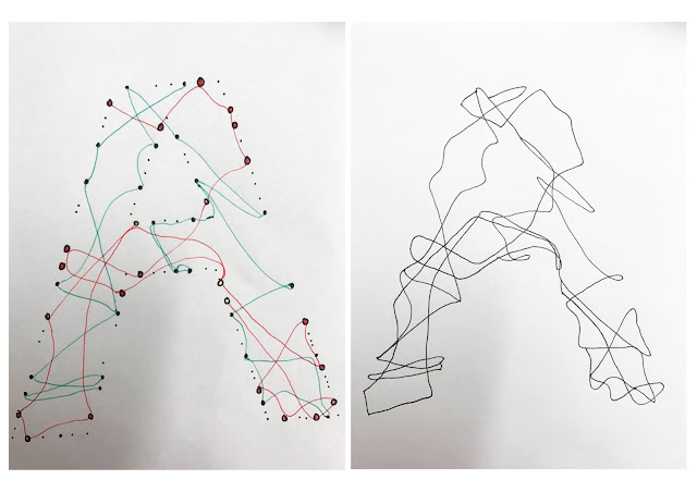
inspired by tangled wires...too wavy, not exactly confusing

colour blind dot insired, kerning needs to be altered;
too legible
altered kerning and tracking to obscure the text and confuse the eye;
more effective than above.
I then thought about combining both of my ideas to try and create a type face which is confusing through the tangles wires, but has a certain loose sense of structure from the colour blind dot idea, with the dots acting as a form of anchor point for the 'wires'.


I think this works well, however i'll create both ideas using illustrator to see which is more effective.


Wednesday, 2 November 2016

Studio Brief 02 - ideas


Taking the advice from my previous typeface initial design crit, i'm trying to "simplify idea 3 slightly to ensure it works as a typeface". 


i'm not sure about the thickness of the ink, it's too bold, i think to communicate confusion there needs to be a smooth transition between each letter form so the viewer has to concentrate and pick out the letters from the negative space.

Another, and i think more effective way to simplify the idea of figure and ground, is to reduce the thickness of the lines. I got inspiration for the following designs by trying to untangle a pair of earphones, the overlapping wires makes the task confusing as you're not sure where to start; which is the level of confusion i want to communicate through my typefaces. 


I'm going to work with this idea more, the thinness of the lines don't distract from the negative space, whilst the overlapping and connecting lines are beginning to communicate confusion. 


Tuesday, 1 November 2016

Studio Brief 02- Typeface design


CHOSEN WORD: confusing | CHOSEN TYPEFACE: Helvetica

"a situation, often with a lot of activity and noise, in which people do not know what to do" - Cambridge dictionary 

"a disorderly jumble
"the mistaking of one thing for another" - Oxford Dictionary 

synonyms:  chaoshavoc, mess, heap, tangle, disruption. 


I am going to create a capitalised typeface based off of the font Helvetica which will communicate my chosen word of ‘confusion’. I have chosen Helvetica as it's a very neutral type face it's used to be understood, to be straight forward and legible; the opposite of my typeface . As I intend to design a typeface which is obscure and disorderly, I believe the context in which it can be used will mainly be for decorative use such as on posters.


CONCEPT 1


Through research I’ve found multiple definitions to base my design off, one by the Oxford Dictionary describes confusion as “a disorderly jumble”. This has given me the idea to design a jumbled and tangled typeface by manipulating for example the descender on a p can be distorted to invade the counter in order to tangle and intertwine the letter. I could also experiment with adding serifs to the letters to add another element to add to the confusion.


Concept 2

My second idea came from looking at colour blind tests which are obviously confusing to the eye. This then led me to research figure and ground organization; a type of ‘perceptual grouping for recognizing objects through vision’. I want to take the idea form Gestalt phsychology of identifying a figure from a background whilst also using the colour blind test idea of layering figures of small shapes or lines in order to create each individual letterform out of the negative space, or the ‘background’. I believe this idea will communicate the confusing personality as you’ll have to look past the figures to see the type. 
initial inspiration for concept 2


After receiving a group crit on my two concepts, concept 2 was preferred by everyone who reviewed my work. It was described as being "more interesting to look at and experiment with" which i agree with, i feel i have a more thorough idea within concept 2 which will be more successful in communicating confusion. 


I produced some initial 'figure and ground' inspired ideas for concept 2 which i also received crit for. Experiment 3 was unanimously "the most effective idea, as the viewer will really have to engage with it", it was described as being "initially confusing to read, but once seen, it really stands out and is very imaginative" which is exactly what i hope to communicate throughout the development of the typeface.  

I was provided with some suggestions to improve my idea, these included "focusing mainly on the letter forms outlines" and "play around more with negative space" and "simplify idea 3 slightly to ensure it works as a typeface". I'm going to use these suggestions to ensure the 'figures' are being used for their purpose of creating the letter forms, and not just for added decoration.