Pharma is the stage name of a musician who required album artwork for his EP titled ‘I dropped acid and now my mum hates me’ which was to be released online. The 2 day response design was asked to withhold similar qualities to that of psychedelic acid house design.
RESEARCH (visual references above)
The client specified that he wanted the design to take influence from acid house/psychedelic design, my role during the collaboration was to create the imagery for the ep cover and so the research was heavily focused around looking for inspiration from existing designs from that genre. As seen above the designs are very clustered, the use of imagery is for lack of a better word, strange. The use of bold vibrant colours and imagery of eyes and figures really communicate the psychedelic nature.
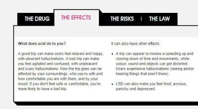
Research was also carried out in to acid as a drug (taken from the title of the song) to see if any of the common effects of the drug could be visually translated. As seen in the screen shot from ask frank, the drug provokes hallucinations, can speed up or slow down time and movement and the colours around you can begin to alter
INITIAL IDEAS
As the design style had already been established by the client, the initial ideas mainly revolved deciding what composition and imagery to use. The client specified some imagery he wanted on the cover including a mouth and a brain. There were many ideas at this point due to the fact that examples of similar styles use a very clustered composition.
The idea was developed of having the brain within the mouth, mimicking the way in which a tab of acid is normally taken.
Utilising the research in to acid as a drug also generated a lot of ideas, such as shifting elements of the design and overlapping them to give the idea of hallucinating and time speeding up.
Using human imagery felt to be the most appropriate response due to the title of the song mentioning the act of taking acid.
The above imagery shows the type of imagery that was decided to be used within the design, using the mouth, the brain, eyes and hands. In addition to this, patterns were felt to be an appropriate visual for the design also, having looked in to the visuals people experience form taking acid, they commented on the shapes and patterns that would appear.
In terms of the composition, a clustered design was agreed by my collaborative partner to be the most appropriate layout as it can be seen in so many psychedelic designs.
DEVELOPMENT
Using the imagery established during the initial ideas stage, above shows the clustered design. The use of the human imagery really works well in communicating the psychedelic nature of the design. Patterns made up of shapes have been included in the design to further the idea of the visuals mimicking those of what someone might see whilst taking acid.
The mouth with the brain was thought both by the client and my collaborative partner to work really well in providing a focal point to an otherwise busy design.
Although the design could of been more detailed, as it will be used for screen; particularly on music streaming websites such as spotify and soundcloud, the size of the artwork will be quite small and so the more detail in the design, the less likely people who view it on it’s primary platform are going to be able to understand it.
above colour variations of the final design can be seen, the colours used re very bight and vibrant; linking to the psychedelic influences behind the design
above is the final piece created during the two day collaboration. Although the final piece meets the requirements of the brief, if given more time it would of been interesting to try out different mediums of production such as painting the piece and adding small details in the block colours, this would of probably communicated the psychedelic nature more and made it a more stand out piece. This being said, the final design works well with the typography my collaborative partner produced, furthering the trippy visuals related to the drug. The imagery used within the design was appropriate and the way the key imagery as requested by the client gives nice point of focus for the viewer, in an otherwise very chaotic design


No comments:
Post a Comment