Tuesday, 27 December 2016

Photographic constraint


I took a series of 50 images of my object (soap) all with the same constraint. I chose to keep the lighting the same for each of the 50 shots, a red light was used to project colour on to the object. Through taking 50 shots all using the same lighting i found that adjusting the position of the lighting produced more colours due to shadows. Further to this, moving the soap around the frame enabled the light to provide different levels of intensities in each shot. 
Below are the 5 most successful images. 


Thursday, 22 December 2016

10 drawings

After looking at Danielle Aubert's Excel drawings (see image below), i created a series of 10 drawing of/relating to my object (soap). 


I experimented with altering the column width and height, colours, layering of image and block colours and the application of geometric shapes within my Excel drawings. 


This was the first time i've ever used Excel for desgn purposes, it was in someways challenging being so restricted with the flatness of everything. I think the layering of images with the pixel like columns works well due to the extreme contrast between a high quality image made up of millions of colours in comparison to pixels of singular colours.  
 

10 pictures

Working conceptually using Microsoft word i have created a series of 10 pictures of my object (soap). 


I chose a very neutral type face (HP regular) as i didn't want a type which had any personality which related to my object, rather the composition of the type being used to communicate my object through creating the drawings. 

soap drink


I was inside a Chinese supermarket and came across these drinks. The drinks contain Aloe Vera particles within them and upon looking at them closely i felt as if the liquid resembled the appearance of soap. 


The transparent liquid pared with the cloudy like particles are what made me think of soap when i looked at them, below i've cropped the bottle in to a different shape to focus in on the different textures within the bottle. 


Tuesday, 20 December 2016

idea development

As i continued my research in to homeless charities i found that useful information for homeless people such as finding urgent places to stay is available over the phone, but in order to find the phone number i had to use the internet; something which homeless people do not have everyday assess to.

shelter provide the opportunity for homeless people to speak to advisers to help find emergency accommodation 365 days a year, at no cost when using a payphone, this has lead me to consider the idea of creating a wayfinding system to direct homeless people to payphones. Information within the wayfinding system would include directions to the payphones, the benefits of ringing and also the phone number. 


code


The above code was developed in 2007 by Emily Read for Charitable magazine The pavement as a mean for homeless people to 'review' amenities and share their experiences with other rough sleepers. 

This guide gives me the idea of using aspects of this code within the wayfinding system to make it more subjective to homeless people. Another aspect of this design i could use within my own is their mention of homeless people making their own marks with chalk, perhaps i could use chalk or a chalk like effect within my designs again to ensure the design is personal to homeless people. 

'Simon on the Streets'


Simon on the streets is a charity which provides "a vital role of being someone (as an organisation not individually) who those who have nowhere else to turn, can turn to for unconditional support. We are a group of people who will show interest in them in a respectful, tolerant, empathetic manner aimed at empowering them to improve their self image and begin to think about making positive changes in their lives, but we ask for nothing in return." 


I found out about the charity through the blue plaques which were unveiled in Huddersfield as part of a project targeting homelessness. The plaques mark places where homeless people who've died once slept, with the colour blue being used for the plaques as they typically draw attention from tourists and residents and highlight when a site has played a critical role in the life of someone famous or noteworthy. 

The plaques are very personal and show empathy and recognition for rough sleepers, the blue colour and the significance behind it is a colour which i may consider using as part of my system.


Studio Brief 01: Wayfinding System - space interpritation

For brief 1 we are to interpret the spaces (Leeds) around us, in order to design our wayfinding system. 

Homelessness is a growing issue in the uk, figures from crisis.org show that rough sleeping figures have risen. Government street counts give a snapshot of the situation within England, in 2015 it was estimated that around 3,569 people sleep on the streets on any one night, thats a rise of 30% since the previous year and double the amount since 2010.

I have decided to create a wayfinding system targeted at the homeless people of Leeds, with my initial ideas based on helping and assisting them in finding their way to shelters, food banks and other locations which can help improve their quality of life.

When creating the sign system their their will be both objective and subjective qualities. A quote from Experimental Jetset states that "most sign systems have the appearance of an objective, functional, almost scientific construction. However under the surface one can find many subjective motives.". 
When looking at existing Leeds sign systems, although they are partially subjective as there are multiple ways of getting to the location they are providing directions for, the design appears very functional, as if not a lot of consideration has gone in to them, they are very objective, something i need to ensure my way finding system isn't. 

I am going to create the wayfinding system with a subjective nature, it will be particular not universal, in the sense that only certain people can engage with it. I don't want my system to project clarity, although the information provided needs to be understood, i believe a more stylized and decorative approach will make the system more personal, homeless people are often disregarded by society, and so to have signage that is just for them, designed to be visually pleasing as well as informative communicates, i believe, that people do care and put time and effort in to helping them. Further to this creating signage which catches the eye of the public can assist in raising awareness of homelessness and the fact that people can help (depending on the information i choose to present within the signage.)
In terms of objectivity, the scale and format of my signage needs to be considered. A large scale will be needed to ensure that the signage is seen, the format needs to be transportable so that it can be placed throughout Leeds; perhaps producing poster like wayfinding systems will be the most appropriate idea; low in cost- can produce more, easily distributed. 

initial design concept - detachable information in relation to the
wayfinding system; directions, helpline number, address.  


I intend to look at existing homeless charities, any cultural and visual references/ language that is perhaps universally recognized within the homeless community, locations within Leeds which the wayfinding systems will be directing to. 

Monday, 19 December 2016

Fetus Soap (object lessons)


"When people see the image of a human fetus, they often associate it with abortion and the warring political perspectives that come with that issue. But to artist and entrepreneur Lily Su, the image of an unborn baby symbolizes ultimate comfort. After creating a series of light boxes featuring images of developing zygotes, she moved on to sculpting her ideas in soap. The unexpected new medium allowed customers to interact with her art in ways that aren't permitted in traditional art galleries (a Basquiat canvas wouldn't be of much use to you in the shower). The result of her project was a life-sized 12- to 13-week-old soap fetus measuring 2.5 inches incased in an embryonic sac." - vice

Study Task 04 - SOAP - pop-culture (object lessons)

You will be given an object. Observe it, analyse it, deconstruct it.


I began researching soap within pop culture as a way to see the object from a new perspective from the beginning, rather than starting my object research with a more mundane approach. 

F I G H T  C L U B


Instantly the poster for fight club came to mind when applying pop culture references to soap, Tyler Durden (Brad Pit) is a soap maker within the film.


S O A P 


 I then looked in to music which mentions soap and i came across Soap by Melanie Martinez.
Released on July 10th 2015, the lyrics to the song use soap in a metaphorical sense, where as the music video (released on the same day) features Martinez in a bath tub filled with soapy water and bubbles. 
Below i have attached the lyrics, along with some stills from the music video which can be viewed here.


Think I just remembered something
I think I left the faucet running
Now my words are filling up the tub
Darling, you're just soaking in it
But I know you'll get out the minute
You notice all your fingers pruning up

I'm tired of being careful, tiptoe, trying to keep the water warm
Let me under your skin
Uh-oh, there it goes, I said too much, it overflowed
Why do I always spill?

I feel it coming out my throat
Guess I better wash my mouth out with soap
God, I wish I never spoke
Now I gotta wash my mouth out with soap

I feel it coming out my throat
Guess I better wash my mouth out with soap
God, I wish I never spoke
Now I gotta wash my mouth out with soap

Think I got myself in trouble
So I fill the bath with bubbles
Then I'll put the towels all away
Should've never said the word "love"
Threw a toaster in the bathtub
I'm sick of all the games I have to play

I'm tired of being careful, tiptoe, trying to keep the water warm
Let me under your skin
Uh-oh, there it goes, I said too much, it overflowed
Why do I always spill?

I feel it coming out my throat
Guess I better wash my mouth out with soap
God, I wish I never spoke
Now I gotta wash my mouth out with soap


Sunday, 18 December 2016

Marber Grid

Marber was commissioned in 1961 by Penguin's art director Germano Facetti, after being impressed by Marber's designs for the Economist. Marber was initially commissioned to produce covers for the books 'language in the modern world' and 'our language' by Simeon Potter, however this lead to Marber being asked, alongside designers Derek Birdsall and John Sewell, to propose a new design approach for Penguin's crime fiction novels. 
Romek Marber Economist Publication Editorial Cover
Romek Marber’s covers for The Economist – 1961 (courtesy of CR Blog)
Based on observation, Marber decided what was needed for the layout and designed his grid based on his findings. Due to the fact that the mystery and crime series style had not changed in 25 years, and the fac that the crime series was one of the most recognizable Penguin series, Marber decided to alter the green hue of the covers only slightly, ensuring it still remained familiar. 
Marber's design of placing the typographic info and the colophon in the top third of the page allows two thirds of the cover providing space for the illustration. In result, this grid gives the cover artwork enough space to draw attention from potential buyers. 
Eventually Marber's grid became the standard layout for the entire range of Penguin paperbacks.  
Marber Grid Penguin Book Cover Design

study task 01 - colour theory


Above is the content within my pantone street guide booklet. I used a very bring colour scheme throughout the book as i felt it was appropriate for the nature of its content. The layout is very hands on, i layered multiple materials and content among on another within each page of the booklet. 
The actual binding of my book is something that i would of liked to work on more, it felt rushed and too rustic, although this partially fits the aesthetic, i believe that a cleaner binding would of been more appropriate.  

Friday, 2 December 2016

Leeds Sign Systems

As a starting point for the way-finding brief, i collected some images of sign systems in leeds. 
All of the signs are very objective; minimal colour is used; and if it is, they are primary tones. 
The type is predominantly sans serif (with the exception of the metal student accommodation map). 

Black Letter

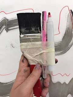
Taking influence from Black Letter, i worked with mono printing and ink and brushes to "Design a set of pictograms and a signage system for a hospital that uses blackletter typefaces and calligraphic flourishes as its foundation.
You are encouraged to develop a distinctly contemporary aesthetic and to avoid any historical pastiche or visual clichés. Your designs should embrace the possibilities offered by this alternative system."


When i began using the brushes with ink i had trouble keeping my wrist in a static motion which resulted in some of the lines being more free flowing than the static, varied stroke width and high contrast i was hoping for. 


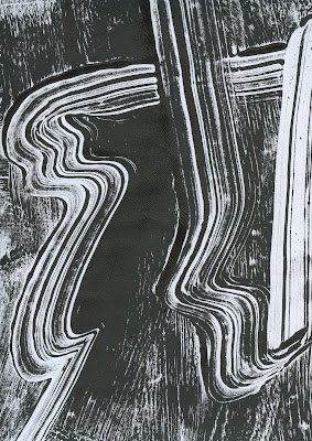
 Mono-printing proved to be the most effective method in achieving the high stroke contrast lines i was hoping for. 


 I created a series of mono-prints trying to communicate a journey of lines which i could then experiment and manipulate using illustrator in order to ensure the design has a contemporary aesthetic. I then intended to use these in some way as the collection of arrows for the hospital. 


I believe the mono printing produced the best results as the lines were more prominent and reflected that of the high contrast black letter more effectively. 
When it came to vectorising the design, illustrator did not show the amount  of the line details within the piece (see below) as i had hoped.  

I then decided to create my arrow system on photoshop to ensure that the flourishes within the individual lines were being communicated. Instead of creating a series of arrows i decided to take a more contemporary, abstract approach and create one piece which has all of the arrows on it with the concept that different elements of the piece could be highlighted to indicate the appropriate direction. 


I feel as if the intruding lines and vivid blue qualities of the piece ensure it's distant from any visual cliches. 
Below i have projected my design, with the addition of the more minimalistic directional arrows (to ensure the contemporary design can still be understood by various audiences) in a contrasting yellow tone.