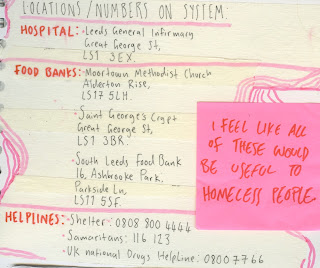
Each of the posters will provide information and useful locations for homeless people in leeds such as hospitals, food banks, shelters and drug helplines.
 The posters will be placed on telephone boxes throughout the city centre of leeds, due to the positioning of the locations. I've decided to place them on telephone boxes as they provide a small sense of shelter, some of the information on the poster relates to phoning organisations, and when relating my concept to the 1970's punk aesthetic i thought of posters being placed all throughout cities and on telephone boxes.
 Stemming from the posters will be tape indicating the direction of the locations, once the direction has been indicated, stickers relating to the destination will be placed upon the ground and surfaces to lead the way.

Through development of my stickers, i wanted to create something that was colourful (due to the punk aesthetic using bright colours), handmade (due to the limitation i set my self, of everything being handmade) and gritty.
I chose to go for a collage based approach using tape, different papaers, ink, pecil, paint, and even dirt and i believe this was effective, the stickers are designed to make the viewer question whether they are okay, or hungry or whether they need someone to talk to.

 The initial designs are all pink and yellow based tones, however i can digitally alter these tones at a later time if i feel it's appropriate.
  |
| The type gets too lost within the piece, and it's essential that it can be understood as it provides the locations/information needed to help the homeless people. |

I tried using the collage effect again, but going for a more consistent use of type and colour, and i really think the design works a lot better as a whole. It has the punk-esque style, yet it is still informative and eye catching.

No comments:
Post a Comment