Tuesday, 31 January 2017

Object Crit

After having a group crit on my initial designs the idea was brought forward of creating a series of illustrations similar to the design of the bathroom scene illustration (below) to be placed on beer mats. 
Displaying dghfdg.jpg

The beer mats would be double sided, one side with an illustration interpreting a quote from the Vice article, the opposite side with the quote printed on it, along with the vice logo in order to promote vice. 
I think this idea is going to work well as it provides context for the designs, and due to Vice's reporting style being quote jokey i feel that the nature of the illustrations will make more sense. 

Object initial designs


"produce a printed document that communicates knowledge from research."

From the research in to soap (see sketchbook), i have decided to focus my designs based upon the Vice article "Gangs of street drinkers are raiding London hospitals to get wasted on Alcoholic hand gel" (see sketchbook for notes). 

The article is lighthearted whilst still addressing the facts of the issue such as this quote from the article "aloe vera-scented hand wash dribbling from the corners of his mouth". 

I decided i wanted to take a playful approach to this brief, i began by adding drink labels to soap dispensers, to play on the quote from the article which reads "If it was a manual dispenser we just filled a half of a cup of this spirit gel and we mixed it with water, half-and-half" and to see what ideas this may lead to. 


I then began to think of ways in which i could present the theme of the article as a poster. I thought taking a less obvious approach would be more appropriate as i wanted to maintain an element of humour in my work so that the print/poster does have context (the article) but it doesn't really give you any direct information and can be appreciated for the design alone. 

I then came up with the concept of creating posters for anti-soap drinking, in a rather sarcastic and obvious way, using the quote from the article "don't drink soap, kids" to base them around.
                                
Displaying dghfdg.jpg
I chose to have the quote from the article presented within a scene i illustrated. i chose to base it in a background to further the soap drinking, and the whole ridiculousness of it all. Purple and pink were used as i wanted to really push the soap theme. I do like this initial design however i'll wait for a group crit to hear suggestions on how i can further it. 

Displaying ggggg.jpg
My next design (colour variations below) is more ambiguous, i layered a bar of soap and a can of beer on a hand (all hand illustrated) to communicate the message of soap being used as a substitute for alcohol such and beer. Although i like this as a print, i'm not sure about what context this would be used for, if it was to be an 'informational' poster then this design would be too unclear to successfully communicate the message.
Displaying geo.jpg


Tuesday, 24 January 2017

Wayfinding in Context

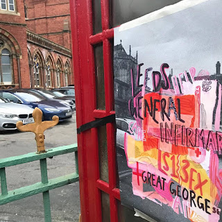
I printed my wayfinding posters on a cheap almost news paper like paper to fit with the punk aesthetic of the whole system. Black tape has been used, stemming from the system to indicate directions, i used a combination of masking tape and black tape to relate to the imagery on the posters, the way the posters have been hung is used to further show how this system is gritty rather than clean and polished, the carefree way the posters have been displayed indicated the fact that these posters are designed to be distributed among the city quickly and at a large scale, so the wayfinding system is able to help as many homeless people as possible. 


Friday, 20 January 2017

final crit

During todays final crit i presented the final designs of the three stickers and three posters for the wayfinding system.


The crit was very positive with there being no adjustments to the design of my system. The only suggestions i was given was to create mockups of my designs using the same collaging technique that i've used throughout the systems, which i will do. 
One suggestion was the idea of collaging an actual telephone box with all the elements of the poster. If this was practical, i would do this however the posters need to be distributed on a large scale, quickly, and so it just isn't practical, as many people in my crit agreed. 


However i did do i rough mock up of this idea (above) to see what the idea could of looked like, however i think that the information makes more sense when positioned close together.


There was some discussion on the size of the posters, i printed them at A3. One comment said that they should be bigger however another comment noted that it needs to ensure it "doesn't want to look like an advertisement". These posters are informal and so i think A3 is a good size, as the info is clearly visible.

Thursday, 19 January 2017

working with photography

From my crit suggestions, the most successful addition to my posters, I've found, is combining the illustration/collage of the posters with my own photographs of the locations surrounding the locations on the posters.

I attempted making an addition to the posters of a section where people could interact and add in their own suggestions, but there's just too much type on the posters this way, everything is too busy and distracting from the main focus of the posters; being the locations and info of the services they can provide. 


I really think the combination of photograph and collage illustration works well together. I've added a grain to each of the photographs, to make them gritty and appropriate for the nature of the posters. Further to this i've made the images black and white due to the posters being so bright and colourful, i didn't want anything distracting from the information. 

Monday, 16 January 2017

Wayfinding Interim Crit

: colour variations based off of 1970's punk poster references


Interim Crit


During my interim crit, i was faced with the opinion that the posters are too busy and would take too long to read. However, it needs to be remembered that these posters are aimed at homeless people not people who are busy on their way to work etc. they have the time to read the posters and understand what they are saying. 


One person commented that the posters gave a homely feel to them, which i agree with, i believe that they show that someone has put effort in to making something for homeless people which looks appropriate for them, it's not just information copy and pasted on to a word document and printed out, their style of living has been considered when designing the aesthetic of the posters.


I was given some suggestions, one was one that i briefly explored in my sketchbook prior to the crit; of having an attachment to the poster where homeless people or any person who knows of any further help or advice, could write it down on the poster, making it an interactive wayfinding system. 


Another suggestion was adding collage on to each individual poster, making each one bespoke, however this idea isn't practical, the posters want to be distributed as widely as possible so they can help as many people as possible. further to this, the addition of literal collage rather than the scanned designs leads to the risk of weather damage due to their outside location. 


Several suggestions were based around adding some photographs somewhere to the poster, to add another visual element that isn't type, i will try this out, along with the idea of cutting up the poster as it is and collaging it back together, to further even more- the hand made limitation. 


Sunday, 15 January 2017

Wayfinding development

For my wayfinding system i am going to create a series of three poster designs and three sticker designs. 
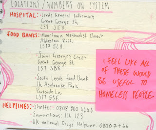
Each of the posters will provide information and useful locations for homeless people in leeds such as hospitals, food banks, shelters and drug helplines.
The posters will be placed on telephone boxes throughout the city centre of leeds, due to the positioning of the locations. I've decided to place them on telephone boxes as they provide a small sense of shelter, some of the information on the poster relates to phoning organisations, and when relating my concept to the 1970's punk aesthetic i thought of posters being placed all throughout cities and on telephone boxes. 
Stemming from the posters will be tape indicating the direction of the locations, once the direction has been indicated, stickers relating to the destination will be placed upon the ground and surfaces to lead the way. 


Through development of my stickers, i wanted to create something that was colourful (due to the punk aesthetic using bright colours), handmade (due to the limitation i set my self, of everything being handmade) and gritty. 
I chose to go for a collage based approach using tape, different papaers, ink, pecil, paint, and even dirt and i believe this was effective, the stickers are designed to make the viewer question whether they are okay, or hungry or whether they need someone to talk to. 

The initial designs are all pink and yellow based tones, however i can digitally alter these tones at a later time if i feel it's appropriate. 

The type gets too lost within the piece, and it's
essential that it can be understood as it
provides the locations/information needed to
help the homeless people.
 After looking at a number of hand drawn typographers (see sketchbook)I began to design the posters for the wayfinding system. I decided to go for the collage technique used on the stickers to ensure the visuals of the wayfinding system where all cohesive with one another, however my first attempt was too busy and messy, not gritty like the stickers were. I believe there was too much white space, i believe the reason why the stickers worked was because there was one tone which was the main focal point of the piece, with others layering on top of it.  


I tried using the collage effect again, but going for a more consistent use of type and colour, and i really think the design works a lot better as a whole. It has the punk-esque style, yet it is still informative and eye catching. 


Tuesday, 10 January 2017

study task 02: penguin book covers


Below i have created a series of three penguin book covers based off of the Marber grid. 
I took a collage approach to this task, using combinations of found images to layer and create a narrative which reflects that of the book. I was inspired by a talk by DR.ME in which they shared images of their predominantly collage based practice.


DR.ME

1984 - survailance cameras used to represent the fact that the characters in the book are constantly under watch. the diary mimics the one the lead writes in in the book and the victory cigarets reference the ones mentioned within the book. 

A clockwork orange - milk references the milk bar the characters visit in the novel, where milk is laced with drugs. the eye relates to the chapter where the lead is forced to watch a film with his eyes being held open. nude figure of a woman has been used to show the sexualisation of women within the novel. 

Lolita- a child's legs are covered with a pair of red lips, red symbolising lust and indicating the sexualisation of children within the novel. A teddy bear can be seen in the distance of this piece, used to again mention the loss of innocence within the novel.


Sunday, 8 January 2017

Wayfinding development: punk

Whilst looking at punk posters from the 1970's i thought about the concept of incorporating music and the punk visual style within my wayfinding system. 
The punk style is very gritty which i felt would work well in relation to homelessness. The idea of incorporating music in to the wayfinding system stems from the concept of basing the wayfinding system around the shelter charity. 
I found multiple songs which feature the word shelter in them, and i believed that incorporating them would support the punk concept more.

"talking about process and desmissal forced removal of the people
on the corner shelter and location"

The Rolling Stones- Gimmie Shelter 
"My very life today
If I don't get some shelter
Oh yeah, I'm gonna fade away"


Pink Floyd- pigs on the wing (pt 2) 
"A shelter from pigs on the wing"

Bob Dylan- Shelter from the Storm 
"Try imagining a place where it's always safe and warm
Come in, she said
I'll give ya shelter from the storm"
However, after considering the concept some more, i realized that i'm straying too far from the actual point of the wayfinding system; to help homeless people. 
I've decided to stray from making my wayfinding system too much of a punk pastiche, rather set a limitation in a way of creating everything by hand, to make it more real and gritty and appropriate to the audience.